Building The Guest Spot: Part 1 - My First Community
I'm not exactly a social butterfly. I can enjoy small groups of like minded people talking about our interests but small talk really drains me. I'm much happier with a computer, book, or just sitting out in the woods.
Since joining Discourse a few months ago, I've been learning the platform by building weird experiments. A transit departure board. A virtual currency system. Tools that push Discourse in directions it wasn't designed for. But they've all been technical exercises. Solo projects. Learning by doing, but doing alone.
The Guest Spot is different. This is my first time helping build something for an actual community of people. Real artists who will (hopefully) use this thing. Not just me poking at APIs and seeing what breaks.
It's exciting. And a little terrifying.
How The Idea Evolved
The original concept was simple: a private forum for tattoo artists. A place where people in the industry could talk shop, share techniques, discuss challenges. No clients. No tourists. Just professionals.
But then I started thinking about how artists actually share their work. Instagram. Almost every tattoo artist is on Instagram. It's where they build their portfolio, attract clients, establish their style. But they don't own any of it. The algorithm decides who sees their posts. Instagram decides what gets buried or promoted. If Instagram changes the rules or shuts down tomorrow, years of work disappears.
What if artists could have both? A professional forum for discussion and a public showcase for their work. Same platform, same data, but they own it all. No algorithm deciding what gets seen. No corporate platform that could pull the rug out.
That's when the concept clicked: build the Instagram-style feed as the front door, with the private forum as the main room. Artists get a beautiful public portfolio plus a real community space. All on infrastructure they control.
What Is The Guest Spot?
The result: an Instagram-style public showcase for tattoo artists, powered by Discourse.
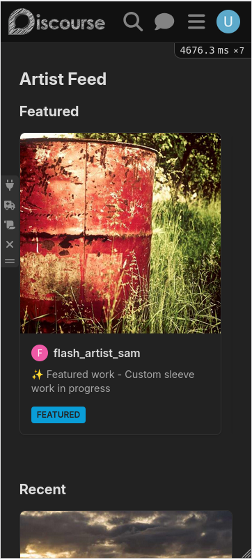
Artists can post photos of their work in a clean, visual feed. Pinned posts appear in a horizontal carousel at the top. Recent work flows down below in a responsive grid. Click any image and you get a full detail page with all the context.
And if you've been vetted, behind the public feed is a private, invite-only Discourse forum. The showcase is the front door. The forum is where the real community happens. Artists can discuss techniques, share experiences, ask questions. It's gated access because tattoo culture values quality and trust.
Think of it as Instagram's visual presentation meets forum depth, with Discourse handling both sides.
Why Discourse Makes Sense Here
Discourse isn't Instagram. It's not designed to be a photo showcase. But it has everything we need to build one:
Custom fields store image URLs and captions. Categories and tags organize content. The permission system handles public showcase vs private forum.
Most importantly, Discourse is built for communities. The forum infrastructure is already there. We're just adding a pretty front door.
And unlike Instagram, artists own everything. The database, the images, the content. They can export it all. No algorithm. No corporate overlord. Just their work, on their terms.
What I've Built So Far
Backend is straightforward Rails stuff:
GuestSpotPostmodel with image URLs (stored as arrays), captions, and pinned status- Migrations for the database schema
- Controllers that handle CRUD operations and serve JSON to the frontend
- Serializers that package post data with user info
Frontend is where it gets interesting. Modern Discourse uses Glimmer components,
which are Ember's latest component format. Template and logic live in the same
.gjs file:
export default class GuestSpotPostCard extends Component {
  get firstImage() {
    return this.args.post.image_urls?.[0];
  }

  <template>
    <LinkTo @route="guest-spot-post" @model={{@post.id}} class="guest-spot-post-card">
      {{#if this.firstImage}}
        <img src={{this.firstImage}} alt={{@post.caption}} class="post-image" />
      {{/if}

      <div class="post-meta">
        <div class="post-author">
          {{avatar @post.user imageSize="small"}}
          <span class="username">{{@post.user.username}}</span>
        </div>

        {{#if @post.caption}}
          <p class="post-caption">{{@post.caption}}</p>
        {{/if}}

        {{#if @post.pinned}}
          <span class="pinned-badge">Featured</span>
        {{/if}}
      </div>
    </LinkTo>
  </template>
}
The card is a link. Click it, you go to the full post page. The whole thing is
wrapped in a LinkTo component so the entire card is interactive.
The Feed Page

Two sections: pinned posts in a horizontal carousel, recent posts in a responsive grid.
The carousel uses CSS flexbox with scroll-snap-type: x mandatory so it feels
smooth on mobile. On phones, each card takes up 80% of the viewport width. On
tablets, 250px. On desktop, 300px. Pure CSS, no JavaScript.
The grid uses CSS Grid with auto-fill and minmax():
.posts-grid {
  display: grid;
  grid-template-columns: repeat(auto-fill, minmax(250px, 1fr));
  gap: 1.5rem;

  @media (max-width: 768px) {
    grid-template-columns: repeat(auto-fill, minmax(150px, 1fr));
    gap: 1rem;
  }

  @media (max-width: 480px) {
    grid-template-columns: 1fr;
    gap: 0.75rem;
  }
}
On phones, we force a single column so cards stay large enough to see the artwork clearly. On tablets and desktops, it flows naturally based on available space.
The Post Page

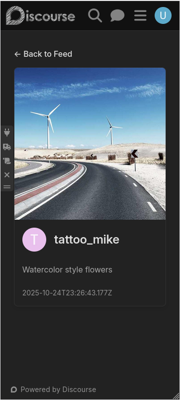
Click any card and you get the full post view. It's designed to let the artwork breathe while keeping all the important context visible.
The layout is simple:
- Back link at the top (returns to feed)
- Full-size image(s) with
object-fit: containso nothing gets cropped - Artist info (avatar + username)
- Full caption with preserved line breaks
- Pinned badge if applicable
Images are wrapped in a card design with rounded corners and subtle shadow. On mobile, padding reduces and max image height adjusts so everything fits nicely on smaller screens. The whole page uses the same responsive breakpoints as the feed (768px for tablets, 480px for phones).
All contained in a centered column with max-width of 900px. Clean, focused, lets the work be the star.
Hiding the Sidebar
Guest Spot has its own route at /guest-spot. But Discourse has a persistent
sidebar. For a public showcase, that doesn't make sense. Artists posting work
shouldn't see forum navigation.
First attempt: route lifecycle hooks.
export default class GuestSpotFeedRoute extends DiscourseRoute {
  activate() {
    super.activate(...arguments);
    const appController = this.controllerFor("application");
    appController.set("showSidebar", false);
    document.body.classList.add("guest-spot-page");
  }

  deactivate() {
    const appController = this.controllerFor("application");
    appController.set("showSidebar", true);
    document.body.classList.remove("guest-spot-page");
    super.deactivate(...arguments);
  }
}
This hides the sidebar. But the hamburger button (.header-sidebar-toggle)
stays visible. Users can toggle it back. Not ideal.
CSS didn't work. Setting controller properties didn't work. So I got pragmatic: DOM manipulation via an initializer.
export default {
  name: "hide-sidebar-toggle-on-guest-spot",

  initialize() {
    withPluginApi("0.8", (api) => {
      api.onPageChange((url) => {
        const toggle = document.querySelector(".header-sidebar-toggle");
        if (toggle) {
          if (url.startsWith("/guest-spot")) {
            toggle.style.display = "none";
          } else {
            toggle.style.display = "";
          }
        }
      });
    });
  },
};
Is it hacky? Yes. Does it work? Also yes. Sometimes pragmatic beats perfect.
Mobile Responsive
Mobile-first isn't just a buzzword here. It's critical. Tattoo artists live on their phones. They're checking Instagram between clients, browsing artist portfolios while waiting for appointments, posting fresh work right after finishing a piece. If this doesn't work perfectly on a phone, it doesn't work at all.
The entire layout is mobile-first. Every component has media queries for tablet and phone breakpoints.
Carousel cards shrink to 80% viewport width on phones so you can see part of the next card (scroll hint). Grid forces a single column on small screens so cards don't get comically tiny. Post detail pages reduce padding and image heights so everything fits nicely without excessive scrolling.
All CSS. No JavaScript calculating widths or handling resize events. The browser does the work, which means it's fast and doesn't drain battery with constant calculations.
What's Next
This is Part 1. We've got the public showcase working. But there's more to build:
- Post creation UI (artists need to upload images and write captions)
- Admin controls (pin/unpin posts from the feed)
- User profile pages (view all posts by a specific artist)
- Comments system integration (if we want interaction on posts)
But most importantly: actually launching this for a real community. Getting feedback from artists. Seeing if this makes sense to people who aren't me.
That's the scary part. Building code is easy. Building for people? That's where it gets real.
Part 2 will cover the creation flow and admin tools. Stay tuned.
If you want to see the code, it's on GitHub: discourse-guest-spot